Creating a counter - Next Experience custom component development
The official docs (as of this writing) for creating a custom Next Experience "Counter Component" can be found here (opens in a new tab), but they seem to be outdated. In some cases that means steps are wrong (opens in a new tab) and it's not clear what the correct step should be. In this tutorial I hope to clarify such gaps by sharing what I did to achieve the same results.
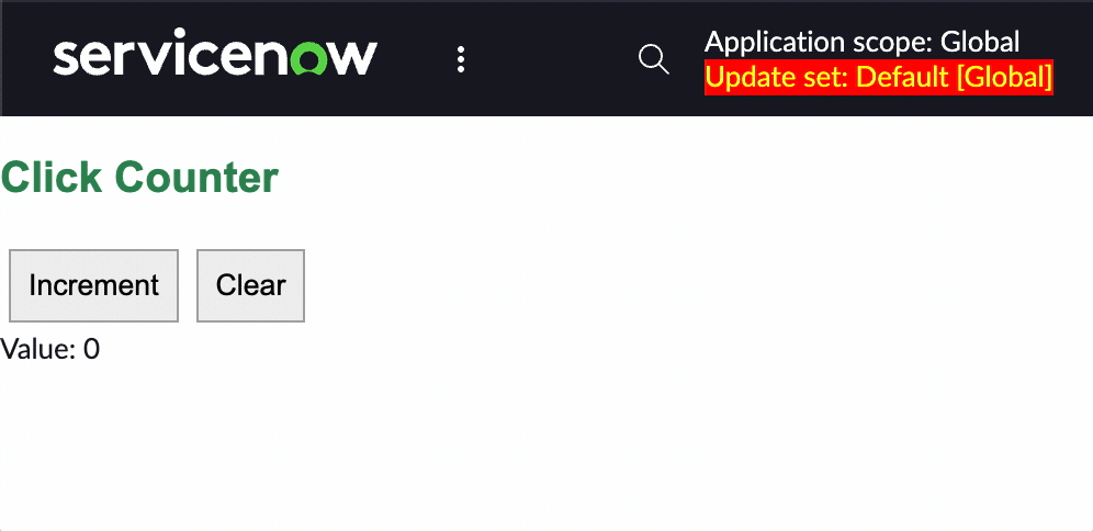
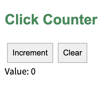
To be clear, this is what we'll be making:
Step 1: Set up the project
Create a clean directory and scaffold the project with this command:
snc ui-component project --profile personal-dev --name @<your-company-name>/counter-component --description "A counter."Now run the following to install all the dependencies.
npm installNow run the following command to run the local development server:
snc ui-component developThe ServiceNow CLI should give you some feedback in the terminal, including the local URL where it's running the component. You can CTRL/CMD + Click that URL to open it in your browser.
ℹ 「wds」: Project is running at http://localhost:8081/There won't be anything there yet, but now we're ready for the next step.
Step 2: Defining the UI
Inside src/x-<number>-counter-component/index.js we can expand our return function to look like this:
return (
	<div>
		// Add this 👇
		<h2>Click Counter</h2>
		<span>
			<button type="button">Increment</button>
		</span>
		<span>
			<button type="button">Clear</button>
		</span>
		<div>Value: </div>
		//
	</div>
);
In the official docs they mention a disclaimer here:
Disclaimer: In this example, we use the native button tag rather then the now-button component. In a component designated for production, you would import and utilize Now Design System components.
At this point you should just have an empty, static counter that doesn't do anything.
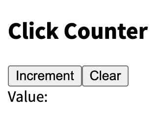
We'll make it interactive in the next step.
Step 3: Making the UI interactive
To make the component interactive we first need to add some state.
To do this first add an initialState property to the object we pass to createCustomElement() at the bottom of our index.js file. Set this property to an object containing the state we desire — in this case we want to set a tally variable to 0.
//...
createCustomElement('x-733577-counter-component', {
	renderer: { type: snabbdom },
	view,
	styles,
	// Add this 👇
	initialState: {
		tally: 0
	}
	//
});
This gives us access to the tally state value inside the component. Since the state variable is already being passed into our component we can access it by destructuring (opens in a new tab) the state object inside our component.
const view = (state, { updateState }) => {
	const { tally } = state;    // Destructuring the state object into the tally variable
	return (
    // ...
}
Now that we've set the initial value for tally we can use it in our render template.
const view = (state, { updateState }) => {
const { tally } = state;
return (
<div>
<h2>Click Counter</h2>
<span>
<button type="button">Increment</button>
</span>
<span>
<button type="button">Clear</button>
</span>
<div>Value: {tally}</div> // Using tally here
</div>
);
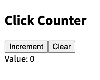
};The result should be a component which displays 0 as the tally value.
Next we need to use the buttons to manipulate the state.
For this we can use the on-click attribute on the button elements. But we cannot simply pass it a function, because a simple function (e.g. updateState) would be executed any time the component is reloaded — not just every time the button is clicked.
Instead we need to pass a function which itself returns a function.
The function that gets returned needs to invoke updateState (opens in a new tab) in order to manipulate the state.
So we do something like this:
const view = (state, { updateState }) => {
const { tally } = state;
return (
<div>
<h2>Click Counter</h2>
<span>
<button
type="button"
on-click={() => updateState({ tally: tally + 1 })}
>
Increment
</button>
</span>
<span>
<button
type="button"
on-click={() => updateState({ tally: 0 })}
>
Clear
</button>
</span>
<div>Value: {tally}</div>
</div>
);
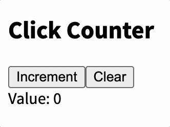
};The result should be an interactive counter:
Step 3: Styling the component
When we scaffolded the project it should have created a styles.scss file in src/x-<number>-counter-component. In order to style our component we can just place our desired styling there.
// src/x-<number>-counter-component/styles.scss
.counter {
	margin: 15px;
}

h2 {
	font-family: Arial;
	color: seagreen;
}

button {
	margin: 4px;
	padding: 8px;
	border: 1px solid darkgray;
}

h3 {
	align-content: center;
	font-size: 16px;
	margin: 12px;
}
Here is the end result:
Step 4: Deploying the component to our instance
Before we deploy our component let's make sure we change its name from the default "My Component". You can do this in the now-ui.json file at the root of your project directory.
{
	"components": {
		"x-733577-counter-component": {
			"innerComponents": [],
			"uiBuilder": {
				"associatedTypes": ["global.core", "global.landing-page"],
				"label": "Counter component", // Change this
				"icon": "document-outline",
				"description": "My counter component", // and possibly this
				"category": "primitives"
			}
		}
	},
	"scopeName": "x_733577_jessems_0"
}
Save it and run the following command in your terminal to deploy.
snc ui-component deployIf you then navigate to UI Builder the component should be available for you to select.
More resources
- The original official counter tutorial (opens in a new tab)
- Component State (Official Docs) (opens in a new tab)
- Official ServiceNow GitHub repository with custom Next Component Examples (opens in a new tab)
- setInitialState() is mentioned in a tutorial, but isn't an existing method (opens in a new tab)