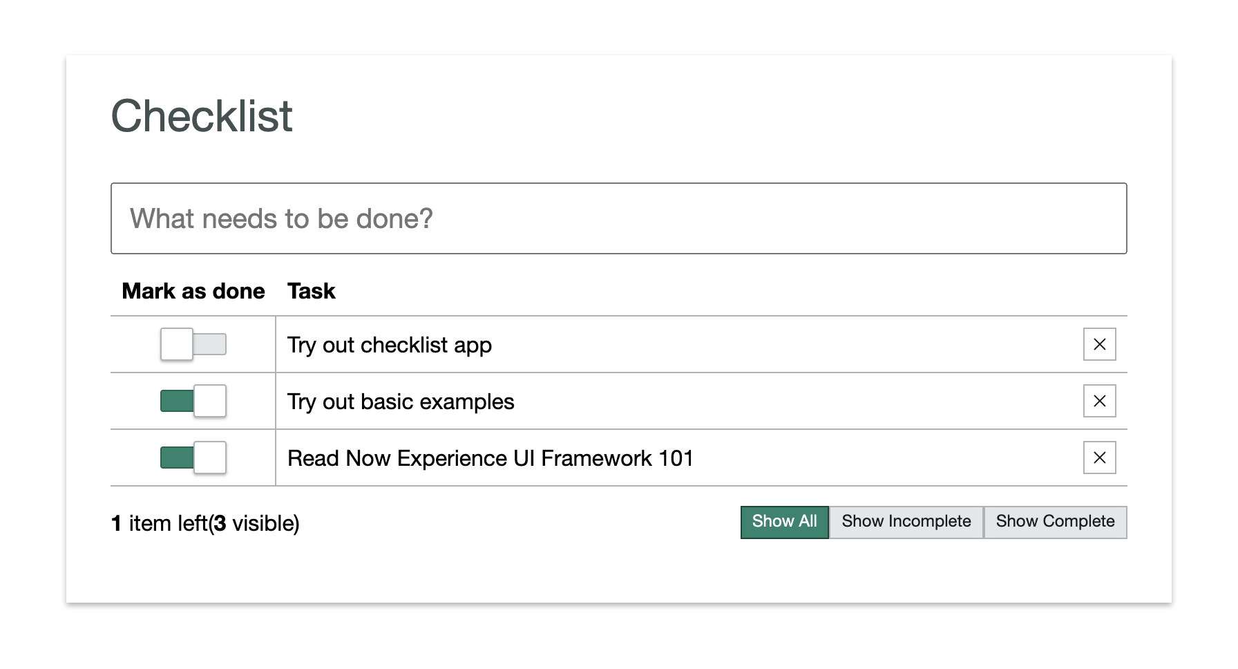
Custom Next Components: Check List
This is a tutorial for building a checklist component using ServiceNow's Next Experience UI framework.
The code for the checklist comes from ServiceNow themselves. They have an official tutorial (opens in a new tab) — of sorts — for this component, but I found it to be a bit skimpy on the details. I'm writing this tutorial to fill in the gaps and to help me understand the component better.
When you've completed the tutorial you'll end up with (essentially) the same code as ServiceNow has in their respository (opens in a new tab). Perhaps with some minor changes to make sure it works.
Before we begin
This tutorial assumes you have your local development set up for Next Experience custom component development. You can read my guide on how to set up your local environment for next custom component development here (opens in a new tab).
Setup
-
Make sure you have
nvminstalled and switch to Node 14 using nvmnvm use 14 -
Set up your project with
snc ui-component project --name @<your-username>/check-list --description 'A check list'. When I did this after not having developed for a while, I got the thekeytar.nodeerror, for which I've written a post here. What works for me is uninstalling theui-componentsnc extension (snc extension remove --name ui-component) and reinstalling it again (snc extension add --name ui-component). -
Run
npm install -
Run
snc ui-component developto run the instance locally
Step 1: The label and delete button
We want to start off by building a check list item component. The overall check list will consist of a list of check list items. Each check list item will have a toggle, a label and a delete button.
It should look something like this:

We will use some of ServiceNow's out-of-box components like now-toggle (opens in a new tab) and now-button (opens in a new tab).
So let's install those first:
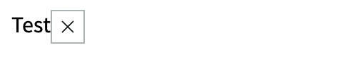
npm install @servicenow/now-toggle @servicenow/now-buttonLet's start by creating a label and a delete button. We'll use a simple static text for the label and we'll use the now-button component for the delete button.
We can look up the usage (opens in a new tab) and API (opens in a new tab) documentation on the ServiceNow developer portal. (Note the menu on the ServiceNow website as of this writing is broken, so use the links above)
The button API exposes several properties that we'll use.
disabledtakes a boolean and mutes the button color and disables user click interactions if set totrue.icondefines the icon to be displayed. We'll use theclose-outlineicon, but you can pick any icon from the icon library.sizesets the size of the button. We'll usesmwhich is the smallest size.variantSets the icon style. We'll usetertiarywhich is designated for "actions that are optional or less important to a workflow.
There's one additional property which we'll set which is not specific to the now-button component: appendtoPayload. This is an undocumented property which adds an object's key-value pairs to the click event payload. For now we'll just add a test object to understand how it works.
// ...other import statements
import '@servicenow/now-button';
const view = (state, { updateState }) => {
return (
<div className="now-checklist-item">
Test
<now-button-iconic
icon="close-outline"
tooltipContent="Delete"
size="sm"
variant="tertiary"
appendtoPayload={{ test: 'test' }}
/>
</div>
);
};
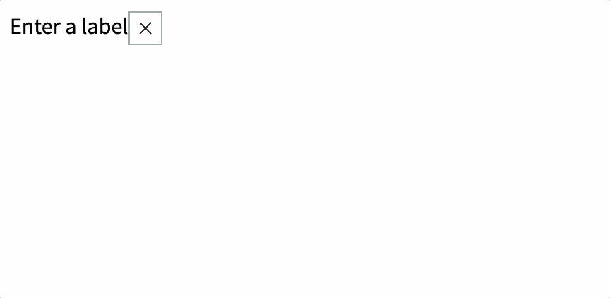
// createCustomElement callThis should give us something like this:
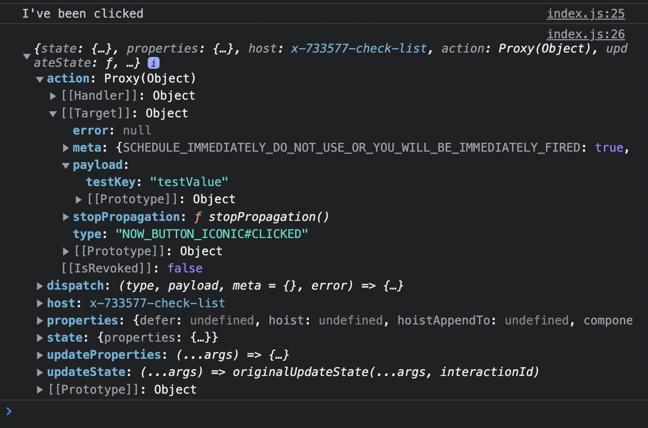
The iconic button is clickable out of the box, but I like to make sure things work before I move on. So let's add an action handler (opens in a new tab) to our createCustomElement call and console log something when the button is clicked.
To create an action handler for the iconic button's click event, all we need is the event's name, which we can get from the API: NOW_BUTTON_ICONIC#CLICKED.
createCustomElement('x-733577-check-list', {
	actionHandlers: {
		'NOW_BUTTON_ICONIC#CLICKED': e => {
			console.log("I've been clicked");
			console.log(e);
		}
	},
	renderer: { type: snabbdom },
	view,
	styles
});
This should result in I've been clicked getting logged into the browser console when the button is clicked as well as the event object.
If we then drill down into action.[[Target]].payload we can see the test object we added to the payload. Later we'll be able to use this for sending along an ID.
Step 2: Configuring the view function
The view function is called with two arguments: state and helpers.
state is an object that contains the state of the component. helpers is an object that contains helper functions that can be used to update the state of the component.
The helpers object contains the following functions:
updateState- Updates the state of the componentdispatch- Used to emit actions when users interact with a componentupdateProperties- Updates the properties of the component
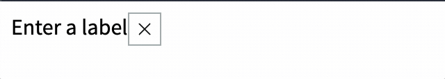
In our createCustomElement call let's add a parameter for properties. We'll use this to declare that we'll be using a label and an editing property and we'll set their default values.
createCustomElement('x-733577-check-list', {
	// ... other parameters
	properties: {
		label: {
			default: 'Enter a label'
		},
		editing: {
			default: false
		}
	}
	// ... other parameters
});
We can access these properties through the state variable, which gets passed through the view function. We can update these properties with the updateProperties function in the second parameter, the helpers object.
const view = (state, { updateProperties }) => {
	// ... view body
};
Let's update the view function to use the label and editing properties.
const view = (state, { updateProperties }) => {
	const {
		properties: { label, editing }
	} = state;
	// ... view body
};
Now let's use the updateProperties to create a function that will update the editing property.
const view = (state, { updateProperties }) => {
	const {
		properties: { label, editing }
	} = state;

	const setEditing = editing => updateProperties({ editing });

	// ... view body
};
Now we can use the setEditing function to update the editing property when the span is double clicked. We can use the on-dblclick attribute for this. We'll also add a ternary operator to the span's text to show that we're in edit mode by appending "(editing)" to the label.
const view = (state, { updateProperties }) => {
	const {
		properties: { label, editing }
	} = state;

	const setEditing = editing => updateProperties({ editing });

	return (
		<div className="now-checklist-item">
			<span
				className="now-checklist-item-cell"
				on-dblclick={() => setEditing(true)}
			>
				{editing ? label + ' (editing)' : label}
			</span>
			<now-button-iconic
				icon="close-outline"
				tooltipContent="Delete"
				size="sm"
				variant="tertiary"
				appendToPayload={{ testKey: 'testValue' }}
			/>
		</div>
	);
};
Here is the final code of our view function:
// Pass state and helpers object, destructure updateProperties from helpers
const view = (state, { updateProperties }) => {
	// Get label and editing variables via destructuring the state object
	const {
		properties: { label, editing }
	} = state;

	// Create a function that calls updateProperties with the new value for editing
	const setEditing = editing => updateProperties({ editing });

	return (
		<div className="now-checklist-item">
			<span
				className="now-checklist-item-cell"
				on-dblclick={() => setEditing(true)} // Call setEditing with true when the span is double clicked
			>
				{editing ? label + ' (editing)' : label}
			</span>
			<now-button-iconic
				icon="close-outline"
				tooltipContent="Delete"
				size="sm"
				variant="tertiary"
				appendToPayload={{ testKey: 'testValue' }}
			/>
		</div>
	);
};
Step 3: Using an input field
Now that we have a way to update the editing property, let's use it to show an input field when the span is double clicked.
First let's encapsulate our span and make it dedicated to displaying the label (as opposed to the input field). We'll call it labelCell.
const labelCell = (
	<span
		className="now-checklist-item-cell"
		on-dblclick={() => setEditing(true)}
	>
		{label}
	</span>
);
Then in our return declaration where we just took out our span, let's add a ternary operator that will show the label when editing is false and the input field when editing is true.
return (
	<div className="now-checklist-item">
		{editing ? inputCell : labelCell} {/* 👈 Add this */}
		<now-button-iconic
			icon="close-outline"
			tooltipContent="Delete"
			size="sm"
			variant="tertiary"
			appendToPayload={{ testKey: 'testValue' }}
		/>
	</div>
);
We just encapsulated our label span element as labelCell, now all we need is an inputCell to replace the span with an input field when editing is true. We can use the built-in on-blur attribute to call setEditing with false when the input field loses focus.
We can do something like this:
const inputCell = (
	<span className="now-checklist-item-cell" role="cell">
		<input
			className="now-checklist-item-input"
			value={label}
			on-blur={() => setEditing(false)}
		/>
	</span>
);
This gives us the following result:
Step 4: Listening for keyboard keys
We've got a task item for which we can enter and exit edit mode, but perhaps you noticed ENTER and ESCAPE don't do anything. Let's fix that.
We can use the on-keydown attribute to listen for keyboard events. For now we'll use the updateProperties helper to update the state. Later on, when we want to update the state of the parent component, we'll use the dispatch helper to emit an action.
Here's the new new inputCell in index.js:
const inputCell = (
	<span className="now-checklist-item-cell" role="cell">
		<input
			className="now-checklist-item-input"
			value={label}
			on-keydown={({ keyCode, target: { value: label } }) => {
				const newLabel = label.trim();
				if (keyCode === 13 && newLabel) {
					updateProperties({ label: newLabel });
					setEditing(false);
				} else if (keyCode === 27) {
					setEditing(false);
				}
			}}
			on-blur={() => setEditing(false)}
		/>
	</span>
);
And here's what the result looks like:
There's one more little improvement that I would like to make before we continue.
Notice how when we double click on the label, the input field is not focused. We can fix that by using the lifecycle hook hook-insert (opens in a new tab) to focus the input field when it is inserted into the DOM. We simply grab the elm (Element) property from the vnode argument and call focus() on it.
const inputCell = (
	<span className="now-checklist-item-cell" role="cell">
		<input
			className="now-checklist-item-input"
			value={label}
			hook-insert={vnode => vnode.elm.focus()} // 👈 Add this
			on-keydown={({ keyCode, target: { value: label } }) => {
				const newLabel = label.trim();
				if (keyCode === 13 && newLabel) {
					updateProperties({ label: newLabel });
					setEditing(false);
				} else if (keyCode === 27) {
					setEditing(false);
				}
			}}
			on-blur={() => setEditing(false)}
		/>
	</span>
);
Now when you double click the input field should be in focus.
Step 5: Adding the toggle
Now that we have a way to edit the label, let's add a toggle to mark the task as complete.
In our createCustomElement declaration, let's add a new property called active and set it to false by default.
createCustomElement('x-733577-check-list', {
	actionHandlers: {
		'NOW_BUTTON_ICONIC#CLICKED': e => {
			console.log("I've been clicked");
			console.log(e);
		}
	},
	view,
	properties: {
		label: {
			default: 'Enter a label'
		},
		editing: {
			default: false
		},
		// 👇 Add this
		active: {
			default: false
		}
		//
	},
	renderer: { type: snabbdom },
	styles
});
Then where we're destructuring the state into properties, let's include the active property.
const {
	properties: { label, editing, active }
} = state;
Now we can use the active property to set the checked attribute on the now-toggle element.
return (
<div className="now-checklist-item">
<span className="now-checklist-item-cell -center" role="cell">
<now-toggle checked={active} disabled={editing} />
</span>
{editing ? inputCell : labelCell}
<now-button-iconic
icon="close-outline"
tooltipContent="Delete"
size="sm"
variant="tertiary"
appendToPayload={{ testKey: 'testValue' }}
/>
</div>
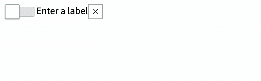
);The result should look like this:
Step 6: Directory structure
Let's start with encapsulating the checklist item. Let's create a directory called checklist-item and move index.js and styles.scss into it.
Then let's rename the parent directory from "x-733577-check-list" to "checklist". You may want to change the name and contents the test file that was generated automatically as well. The resulting structure of the src directory should look like this:
.
└── checklist
    ├── __tests__
    │   └── test.checklist.js
    ├── checklist-item
    │   ├── index.js
    │   └── styles.scss
    └── index.js
You'll want to make sure the checklist folder has an index.js file which contains the following:
import './checklist-item';We also need to change our createCustomElement declaration to reflect the new directory structure:
createCustomElement('checklist', {
	// View and actionHandlers omitted for brevity
});
You will need to stop (CTRL + C on Windows, CMD + C on Mac) and restart snc ui-component develop the development server to make sure your changes are picked up.
You will also need to rename the reference in the now-ui.json config file:
{
	"components": {
		"checklist": {
			"innerComponents": [],
			"uiBuilder": {
				"associatedTypes": ["global.core", "global.landing-page"],
				"label": "My Component",
				"icon": "document-outline",
				"description": "A description of my component",
				"category": "primitives"
			}
		}
	},
	"scopeName": "x_733577_jessems_2"
}
Step 7: Refactoring the constants
Let's put the constants in a constants file. Create a file called constants.js in the checklist directory. Then create two constants for the enter and escape keys we used earlier as well as one for the event that is fired on toggle click:
export const ENTER_KEY_CODE = 13;
export const ESC_KEY_CODE = 27;
export const TOGGLE_CLICKED = 'NOW_TOGGLE#CLICKED';
Then import them into src/checklist/checklist-item/index.js:
import { ENTER_KEY_CODE, ESC_KEY_CODE, TOGGLE_CLICKED } from '../constants';
// the rest of the code omitted for brevity
Then use the key codes in the on-keydown handler in index.js:
// ...
on-keydown={({keyCode, target: {value: label}}) => {
					const newLabel = label.trim();
					if (keyCode === ENTER_KEY_CODE) { // 👈 Use the constant
						setEditing(false);
						if (newLabel) {
							dispatch(CHECKLIST_ITEM_UPDATED, {
								itemId,
								short_description: newLabel
							});
						}
					} else if (keyCode === ESC_KEY_CODE) { // 👈 Use the constant
						setEditing(false);
					}
				}}
// ...
And use the toggle event constant in the actionHandlers:
createCustomElement('checklist-item', {
	actionHandlers: {
		[TOGGLE_CLICKED]: e => {
			// ☝️ Use the constant
			console.log("I've been clicked");
			console.log(e);
		}
	}
	// ..
});
Step 8: Refactoring Actions Handlers and Views
Let's move the action handlers and view into their own files. Create a file called actions.js in the checklist directory and move the action handlers (including the import we just updated) into it:
import { TOGGLE_CLICKED } from '../../constants';

export default {
	actionHandlers: {
		[TOGGLE_CLICKED]: e => {
			console.log("I've been clicked");
			console.log(e);
		}
	}
};
Before we import the actions into index.js, let's create a file called view.js in the checklist directory and move the view into it and export it:
import '@servicenow/now-toggle';
import { ENTER_KEY_CODE, ESC_KEY_CODE } from '../constants';

export default (state, { updateProperties }) => {
	const {
		properties: { label, editing, active }
	} = state;

	const setEditing = editing => updateProperties({ editing });

	const labelCell = (
		<span
			className="now-checklist-item-cell"
			on-dblclick={() => setEditing(true)}
		>
			{label}
		</span>
	);

	const inputCell = (
		<span className="now-checklist-item-cell" role="cell">
			<input
				className="now-checklist-item-input"
				value={label}
				hook-insert={vnode => vnode.elm.focus()}
				on-keydown={({ keyCode, target: { value: label } }) => {
					const newLabel = label.trim();
					if (keyCode === ENTER_KEY_CODE && newLabel) {
						updateProperties({ label: newLabel });
						setEditing(false);
					} else if (keyCode === ESC_KEY_CODE) {
						setEditing(false);
					}
				}}
				on-blur={() => setEditing(false)}
			/>
		</span>
	);

	return (
		<div className="now-checklist-item">
			<span className="now-checklist-item-cell -center" role="cell">
				<now-toggle checked={active} disabled={editing} />
			</span>
			{editing ? inputCell : labelCell}
			<now-button-iconic
				icon="close-outline"
				tooltipContent="Delete"
				size="sm"
				variant="tertiary"
				appendToPayload={{ testKey: 'testValue' }}
			/>
		</div>
	);
};
Then let's rename src/checklist/checklist-item/index.js to src/checklist/checklist-item/checklist-item.js and import and replace the actions and view:
import { createCustomElement } from '@servicenow/ui-core';
import snabbdom from '@servicenow/ui-renderer-snabbdom';
import styles from './styles.scss';
import '@servicenow/now-toggle';
import '@servicenow/now-button';
import checklistItemAction from './actions';
import view from './view';

createCustomElement('checklist-item', {
	view,
	properties: {
		label: {
			default: 'Enter a label'
		},
		editing: {
			default: false
		},
		active: {
			default: false
		}
	},
	renderer: { type: snabbdom },
	styles,
	...checklistItemAction
});
Finally, let's create a src/checklist/checklist-item/index.js file to import the checklist-item.js file:
import './checklist-item';Your final directory structure should look like this:
.
└── checklist
    ├── __tests__
    │   └── test.checklist.js
    ├── checklist-item
    │   ├── actions.js
    │   ├── checklist-item.js
    │   ├── index.js
    │   ├── styles.scss
    │   └── view.js
    ├── constants.js
    └── index.js
The hash for this commit is: bd295d8347bcaad904b5c1e01e69977ca021ca16
Step 9: Adding CSS to the checklist item
Let's add the SCSS provided by ServiceNow to the checklist item
Rename the styles.scss file to checklist-item.scss and add the following:
@import '@servicenow/sass-kit/host';

:host {
	display: block;
}

.now-checklist-item {
	display: grid;
	align-items: center;
	grid-template-columns: now-fn-px2rem(120px) 1fr now-fn-px2rem(32px);
	border-bottom-width: 1px;
	border-bottom-style: solid;
	border-bottom-color: RGB($now-color--divider-secondary);
}

.now-checklist-item-cell {
	display: flex;
	padding: $now-global-space--sm;

	&:first-child {
		border-right-width: 1px;
		border-right-style: solid;
		border-right-color: RGB($now-color--divider-secondary);
	}

	&.-center {
		justify-content: center;
	}
}

.now-checklist-item-input {
	margin: 0;
	padding: 0;
	font-size: inherit;
	line-height: inherit;
	font-family: inherit;
}
Then update the import statement in checklist-item.js:
// ...
import styles from './checklist-item.scss';
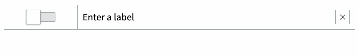
// ...The result should look like this:
The hash for this commit is 269e20fa333e970b87c86cfc9e51bfc032d601ae
Step 10: Configuring the action handler
We're almost ready with our check list component.
Let's update the action handler so that when a checklist item is updated there's an event that propagates up to the parent checklist component.
First let's prevent the original TOGGLE_CLICKED event from propagating up to the parent checklist component and let's define an effect (link to Docs (opens in a new tab)), which is a way of allowing us to define what custom actions we want to take when a checklist item is updated.
import { TOGGLE_CLICKED } from '../constants';

export default {
	actionHandlers: {
		[TOGGLE_CLICKED]: {
			stopPropagation: true,
			effect: ({ state, action, dispatch }) => {}
		}
	}
};
We set the effect property to a function definition. This function will be invoked when the TOGGLE_CLICKED action is triggered. It receives an object with the following properties:
state: the current state of the componentaction: the action that was triggereddispatch: a function that allows us to dispatch actions
Inside the effect function definition let's disable the default action handler for TOGGLE_CLICKED so we can handle it ourselves. We do this by invoking the preventDefault (opens in a new tab) method on the action object:
import { TOGGLE_CLICKED } from '../constants';

export default {
	actionHandlers: {
		[TOGGLE_CLICKED]: {
			stopPropagation: true,
			effect: ({ state, action, dispatch }) => {
				action.preventDefault();
			}
		}
	}
};
Then let's get the checklist-item itemId by destructuring the state.properties object and the checklist-item value by destructuring the action.payload object. Finally let's also dispatch our own action which we'll call CHECKLIST_ITEM_UPDATED and we'll provide it the payload of an object with the itemId and the value:
import { TOGGLE_CLICKED } from '../constants';

export default {
	actionHandlers: {
		[TOGGLE_CLICKED]: {
			stopPropagation: true,
			effect: ({ state, action, dispatch }) => {
				action.preventDefault();
				const { itemId } = state.properties;
				const { value } = action.payload;
				dispatch(CHECKLIST_ITEM_UPDATED, { itemId, active: value });
			}
		}
	}
};
Right now we're not doing anything with the CHECKLIST_ITEM_UPDATED action, but we'll do that in a future step.
The commit hash for this step is a56b25ba6eed3e83d884b07523a57e0306d44ac6
Step 11: Adding the checklist item to the checklist
Let's have a quick look at the blueprint of what we're building.
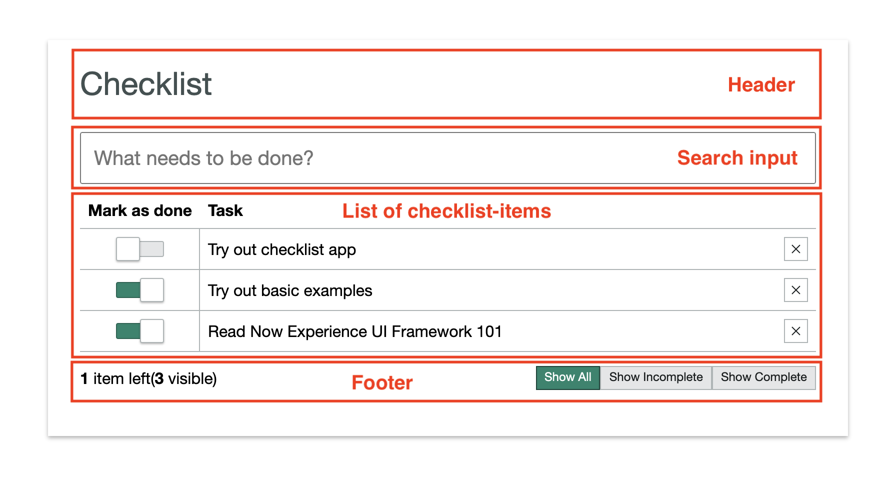
We're going to have a checklist component which will contain a header, a search input (to filter the checklist items), the list of checklist-items and a footer with some calculated values and buttons.
Unlike in the checklist-item component let's start off by encapsulating the actionHandlers and View from the get go.
To keep things simple let's just try to display our checklist-item component from within our new parent checklist-component.
Let's start by creating a folder at the same level as checklist-item called checklist. Inside this folder let's create a checklist.js file, a view.js file and a actions.js file